
Sunday 24 March 2013
Editing and filming log sheet
Friday 22 March 2013


Thursday 21 March 2013
My finished digi pack
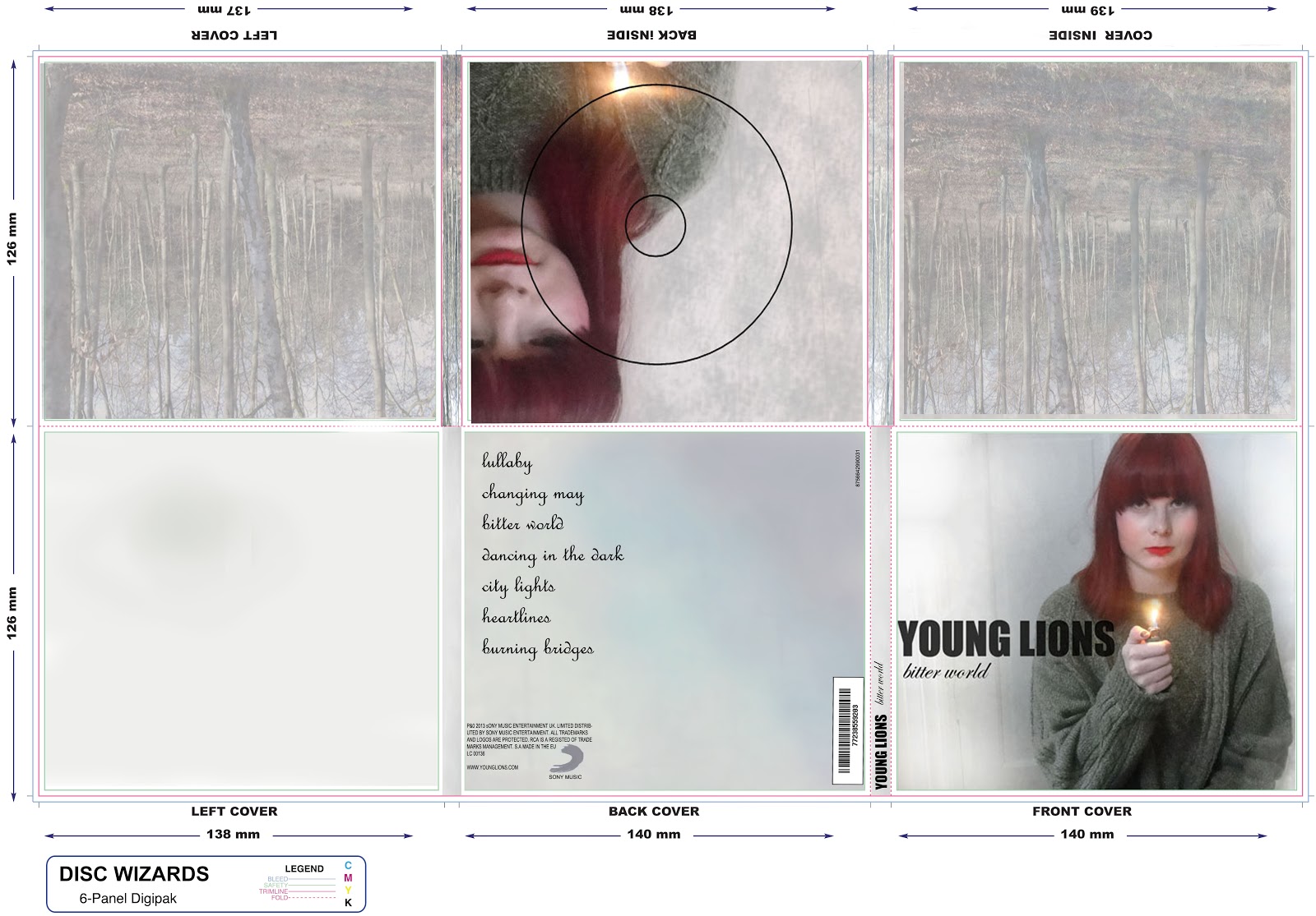
This is my finished digi pack which I created from scratch on photoshop. This design took me a long time to complete as all images have been taken and manipulated by me. I was aiming for a proffesional and clear finish with good quality photo's and I believe I have achieved this. I like the images I have chosen as they're very eye catching espically the front cover image as I've made Ellies hair more vibrant and changed the opacity of her to make it look more atistic. On this image I have also changed the background as it was againt a door, it now just looks more plain which I wanted to do to make my artist stand out more. I also like the use of the lighter in her hand as their is also a shot of her in the video holding a lighter alongside wearing the same clothes. This was important as I wanted my digi pack to be easily recognized as it has mainly simalirites to my music video. The house style I have chosen for my digi back I believe suits well as it makes my artist the centre of attention espically with the vibrant colour of her hair. The trees I have used for the inner covers I think suit well as trees are also shown in the video. I believe it's very important to have similarities between all my word to show that they're all conneceted which I think makes it look more realistic and proffesional. Overall I'm very pleased with my digi pack design as I really thought about the little details to make it look interesting.
Wednesday 13 March 2013
Choices for my front cover

From all the photo's I have taken of my artist I've decided it will be one of these which I choose from my font cover. Although they're only slightly different my aim is to make my digi pack look as professional as possible.
In the first image I have placed trees from the music video behind her making them a low opacity so they can be seen through the white background. I like this image as it looks like a lot of time has been spent on it and looks slightly ghost like.

The second image I like as although its far more plain I think it draws far more attention to her, which is good as she's the main image. I also slightly think it looks more realistic as it's not cluttered.
Wednesday 6 March 2013
Analysis of existing digipaks

Front cover- I like the use of the limited amount of colours situated on both front covers along with the font which is the same on both CDs. The choice of this fits the genre as they're simplistic sans-serif fonts to make this particular band easily recognisable. The fact that the name of the band is larger then everything else on the design is also important as it follows expectations of a successful CD cover.
On the CD design at the bottom of this image 'Science and Faith' I particularly like as it's simple yet very artistic with the image of clasping hands between a man and a woman. Although it's very simple it's very eye catching as it shows it's difference from other CD covers which usually show the band, like the CD shown above. I also like the top CD as it again shows a photography like nature and the image is good quality. I believe it's also very deliberate the the main singer is larger and closer to the camera then the rest of the band to show his importance. I also like the use of the background as it compliments the bands face pigments from the help of the sun and the sand in the background.
The CD itself
I love the CD itself as it's simple yet eye catching and fits the house style colour with the rest of the design ( oranges and sepia's ) The image also shown on the CD shows a spiral like pattern which I believe connects with science, again this is deliberate as it relates back to the name of the album 'Science and Faith'.
The back of the CD
This connects very well with the front cover as it again shows two hands touching in a different position. Because of this and the contribution of the same use colours a person could easily see that they were part of the same album which I want to clearly show in my digipak . The text from the back of the CD also matches the front which shows it's continutity.
In conclsuion I really like these albums and intend to use similar colours as I think it matches the genre of 'indie' and other similar genres. I also would like to use the technique of making sure the digipak isn't cluttered as this one isn't so the audience focuses on the main image such as the hands touching. Lastly I also like the vintage look of the CD as on both front and back it looks to be seen as a little bit 'scratched' from darker lines being placed on the background.

Front Cover
I like the image chosen for coldplays front cover of 'Viva La Vida' as it's very artistic showing a the French winning a battle. I believe this image was chosen as it's very bold and connects with the idea of freedom as the album name in spanish means " live the life" and is often used in english to say '"long live". The font used I also think matches well as it's very bold, white and slightly wacky which draws attention both to this and the image behind it. Although very simple I think the use of colours and image really make it a masterpice of an album cover and easily recogniseable.
Inside image
The individual images of the band shown on the inside of the album cover I think contribute well to the rest of the design as it shows the band performing and a sence of them being equal ( as all images are the same size ). Each image also shows the audience what each member speicalises in such as drums, guitar and bass. I think the band have been purpoesly shown on the inside as they're not on the front cover.
Back Cover
I'm not a big lover of the back of the CD cover as I think it's too plain and not very eye catching. I think it's mainly because the background is a block colour of grey which doesn't make it look that interesting, however the yellow text does stand out.
Subscribe to:
Posts (Atom)